Reflection

When reflecting back on this project there are a lot of things I am happy with however, there are also a lot of things I would like to have done differently or improve upon. My aim at the start of this project was to plan and realise a media product that would effectively assist children with learning difficulties and the parents of those children. This aim lead me to discovering that a lot of children with learning difficulties are taught in mainstream schools due to a lack of specialist schools being able to accommodate them and thus they end up not getting all of the attention that they need. I wanted to create something that could recognise that a child might need a different style of help in comparison to their peers but wouldn’t make them feel segregated or alienated within the class itself. I also wanted to create something to increase communication between teachers and parents because research show that this partnership is vital in helping a child live with their learning difficulty.

Because of the nature of the project there were a lot of mistakes that could be made. When collecting feedback on my idea there was a lot of negative criticism, particularly from parents who didn’t believe that teachers would have the time to use such an app, there were also issues of how technology couldn’t replace empathy. However because I had no way of testing their theory at the time other than through forums in which I also received a lot of positive feedback, I had to follow through with my original idea with little further reform. If I could redo this I would liked to have got in touch with more teachers to discover whether my idea was practical enough to work in the real world and what improvements I would need to make it work. However I ended up going into designing the prototype unsure whether the app could actually be used, this made designing it quite a challenge.

I really enjoyed designing this app because I enjoyed the creative challenge of designing for adults but with children in mind. When deciding on a theme I knew that I wanted a very simplistic design due to the small amount of space available on an app screen but also because I needed to make the app easy and pleasant to use so that using it didn’t feel like a chore for the user. I think the colours combined with the theme successfully create a calming educational atmosphere that it non-threatening for the user. My biggest design struggle was coming up with a way to graphically represent children and represent the various behaviour traits and moods. This was a challenge, as I didn’t want to be too stereotypical or offensive in my choice of traits. If I had more time I would have liked to have thought more about the layout and features of the profile screens, I would also have liked to improved drastically upon the promotional video and use more of my after effects skills to make it more visually interesting.

Overall however, I believe that I have successfully fulfilled my aims with ‘Headway’.

App Prototype and Animation

Once I had all of the graphics in place for my PDF turning them into a little animation was quite easy. I didn’t want anything too complicated as I had a very limited time frame to create it in however something quick and easy that successfully gets the point and the idea of the app across was the aim.

2 videos for inspiration

My animation

Once I had created all of the screen designs for the PDF is also became quite easy to put them into Adobe Experience Design to create a basic prototype. With more time I would have liked to have added a lot more pages and make every button fully functioning however I think the prototype gets across the general gist of the app and is a good starting point for using it.

https://xd.adobe.com/view/20ebd96a-258c-4dc8-5495-d0eacda131a0/

HICON

PDF Design and Inspiration

When designing my PDF to display all of my screen designs I looked to behance.net for a lot of inspiration. I knew that I wanted a very simplistic PDF that matched the overal theme of my app however I was also interested in using a combination of flat design and 3D, which is not normally I combination that you would think of putting together.

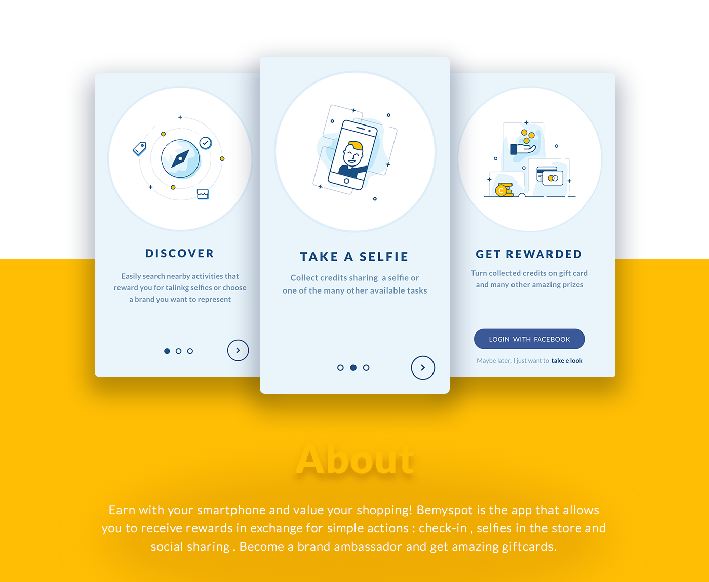
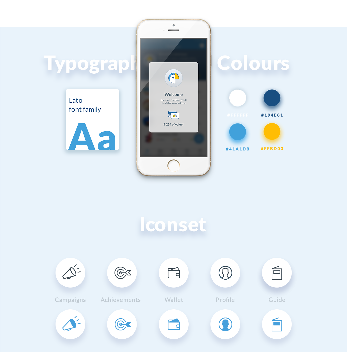
https://www.behance.net/gallery/34563897/Bemyspot-iOS-Android-app

This design for ‘Bemyspot’ was a particular influence as I liked the layout of it. I liked the use of different coloured blocks to break the PDF up into individual sections and the incorporation of the colour theme and typography. I used this same sort of layout for the beginning of my PDF.


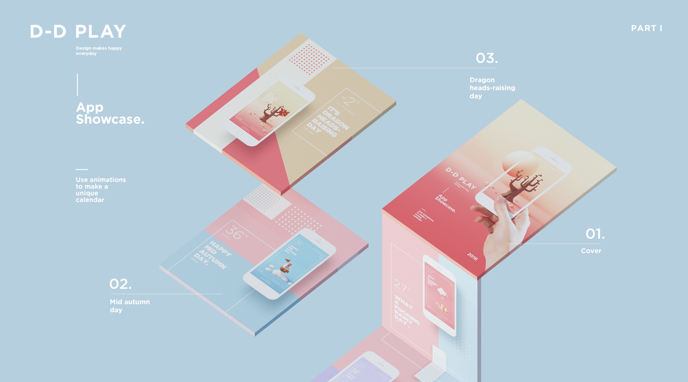
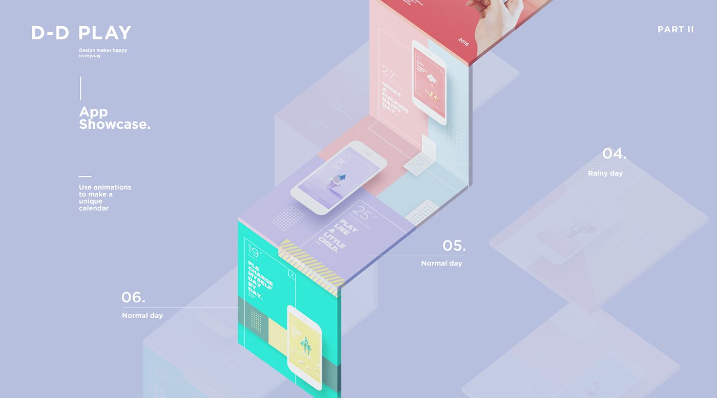
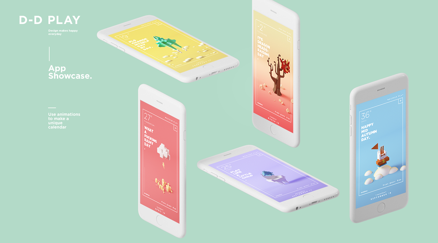
https://www.behance.net/gallery/35452259/D-D-Play

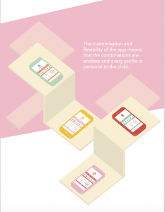
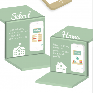
This design from D-D PLAY was a big influence as I really liked the colours as they were already similar to the theme that I had chosen however I also really enjoyed the 3D aspect of it. To recreate this I used illustrators 3D ‘Extrude and Bevel’ feature to create my own 3D steps and iPhones to display my screens on.

Below you can see my take on these two PDF designs and the incorporation of their style into my work.

Screen Shot 2016-04-15 at 2.13.49 pm

Screen Shot 2016-04-15 at 2.15.15 pm

Screen Shot 2016-04-15 at 2.15.07 pm

Screen Shot 2016-04-15 at 2.14.57 pm

Asset creation and screen designs

Screen Designs

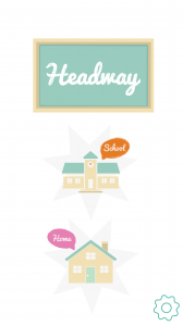
When beginning work on the screen designs for the app prototype I began by starting with the screens that the user would first come into contact with this.Because of this, when designing the main landing page I knew that I had to set the mood and theme for the app right away. The main page establishes my colour theme and the flat design style of the app, it also introduces the logo and name of the app itself.

Untitled-70

I chose these colours because they compliment each other, work well at promoting a calm and welcoming environment for the user and can be applicable to an app designed to have a child as the subject.

Landing page
Screen 1


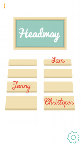
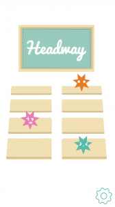
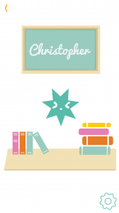
When designing a profile selecting screen for the end user I went through a series of designs. In general I struggled with how to represent the child graphically within the app. I began by just writing the names of the ‘students’ however although this would be practical it didn’t have the same effect as the other graphic elements that I had designed and I wanted to try and come up with a more creative method of representation. This resulted in me producing a number of different emoticons that I thought were simple and clear enough to be displayed on an app, however also distinguishable enough to represent different children/students. Below are some of the screen designs that I came up with.

SchoolscreenHOME\


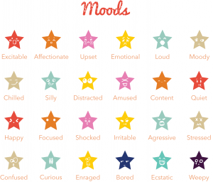
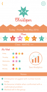
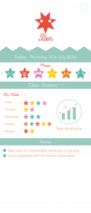
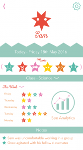
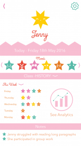
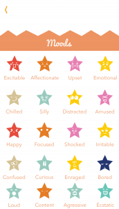
In the end I decided although the emoticons looked better, It would be impractical for the user to remember which student/child was which emoticon therefore the name of the child/student had to incorporated in some way. For the class selection screen I opted for the traditional name however with the home selection screen I incorporated both the emoticon and the name into the design as there was more space. Although the emoticons were not used a great deal in these screens I found that I would have greater use for them later when designing the profiles themselves so I chose to give mood names to each of them.

moodsff


When naming all of the emoticons I tried to come up with names that would be applicable to children both in the classroom and at home. I also tried to think of stereotypical reactions to work and emotional responses that might occur throughout the day however I am aware that there would be a lot more of them to add to increase the accuracy.

Christopher deleteSam JennyMOODS