This week I explored what makes a good or bad logo.
Interflora
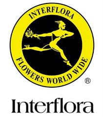
Interflora is a worldly recognised brand, with its Mercury Man being in its logo design since 1914, they are known for their swift and timely delivery of high quality flowers. However in my opinion their logo is far from high quality. It has very little to do with flowers as the flowers held in the mercury mans hand are not the main focus and the high contrasting colours distract from the companies main function. The font also does not scream for the fluidity and elegance of floristry and flowers.
Birchbox
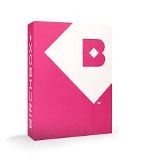
Based in New York since 2010 Birchbox offers a subscriptions based service that provides customers with a monthly box filled with various beauty related items. Their logo captures their demographic by appealing to women and girls of all ages with the colours that they pick that change frequently with the brands monthly themes, but always the memorable box like Birchbox font. The logo also has subtle suggestions to the companies function always incorporating a box into the logo.
LEGO
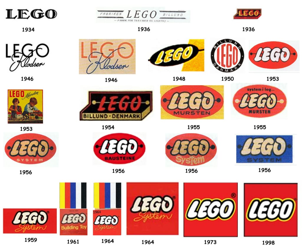
The LEGO logo has changed drastically throughout time. It started off with a much more serious set of logos which correlated to that of Legos original foundation in carpentry moving into making wooden toys. The logo fit because it needed to establish itself as a brand to be trusted so its traditional logo created that high quality feel that Lego is known for today. Around 1953 you started to see that famous font that Lego are associated and then a series slight adjustments running up to the current logo. For example the adding and removal of the ‘system’ part of the logo. The ‘system’ was added once the company got more heavily involved into producing the little plastic building blocks and gave their toys a unique ‘system’ that meant that children could interchange all toys from Lego to make anything that they could imagine… teaching children about the world through their miniature creations. Today Legos logo is so well known throughout the world that they no longer need the ‘system’ or even anything else in the logo except for the name ‘LEGO’. Its colours have also stayed consistent, the use of the black and white to make the words stand out, the red and yellow. The evolution of a logo can be caused by many different factors however within todays online world there is an increasing need for versatile logos that can be used anywhere on any platform, they need to be blown up to fit on billboards and shrunk to fit on tiny screens. With so much information being thrown at people and consumed every day logos need to be simpler and transfer information as quickly and efficiently as possible. Lego is an example of this, adapting to suit todays market, but not losing sight of their roots and staying true to their style.