Week 5 – Visually Effective Visual Effects… Motion Tracking!

In this weeks workshop we looked at Motion Tracking.

An important part of Motion Tracking is understanding what it can and cannot do. Motion Tracking can track the 2D position – the X and Y – of a small cluster of pixels of which the data can then be attached to another layer of object. However it cannot track pixels that are obscured by another object or by motion blur and it cannot track the 3D position – the additional Z axis – of a cluster of pixels.

Our first experimentation involved the Motion Tracking of points on a box.

We learnt that the Motion Tracking tags struggles to track pixel clusters that had been filmed in a low shutter speed because of the motion blur as opposed to a higher shutter speed. Also if the points were obscured or went off the edge of the footage then the tracking was lost. We also experimented using 4 tracking points using the Corner Pin Perspective to achieve different results… we discovered that by using the 4 tracking points we were able to skew the image to make it appear 3D when it isn’t.

Our second experimentation involved using Motion tracking to create a 2D sky replacement. We attached the tracking points to a section of building and the tip of a tree that were not obscured by anything, then attached that data to a null layer and attached our sky replacement to that. Then using a mask and feathering it out created a very basic sky replacement. We also then explored ways of making the sky replacement more realistic and believable by adding in different lighting effects and adding in light sources.

Week 4 – Augmented Reality

This week we had a look at Augmented Reality. A technology that superimposes a computer-generated image on a user’s view of the real world, thus providing a composite view. Mostly this involved looking at what was possible with the Augment App (http://www.augmentedev.com)

 
With Augment you are able to simulate your 3D models in real world, real size and real time. This is all done by using trackers. You can either use the universal tracker which is tracked by the app automatically, you can set your own images as trackers or you can go trackerless which automatically applies your 3D object to the floor.
The App is great fun in your spare time but is also potentially really useful in for sales in businesses. I had a play around with the App myself and here are some of the things that I produced.
This is Clive in a lecture theatre… with left shark.

Week 3 – I project a riot

Projection Mapping

Projection Mapping uses everyday video projectors, but instead of projecting on a flat screen (e.g. to display a PowerPoint), light is mapped onto any surface, turning common objects of any 3D shape into interactive displays. More formally, projection mapping is “the display of an image on a non-flat or non-white surface”.

One of the first examples of Projection Mapping commercially was at DisneyLand California 1969. The dark ride featured a number of interesting optical illusions, including a disembodied head, Madame Leota, and 5 singing busts, the ‘Grim Grinning Ghosts‘, singing the theme song of the ride. These were accomplished by filming head-shots of the singers (with 16 mm film) and then projecting this film onto busts of their faces.

In 1998 Projection mapping really started to get traction when it was pursued in academia. “Spatial Augmented Reality” was born out of the work by at UNC Chapel Hill by Ramesh RaskarGreg WelchHenry Fuchs and Deepak Bandyopadhyay et al. It all got started with a paper The Office of the Future [2]. The Office of the Future envisioned a world where projectors could cover any surface. Instead of staring at a small computer monitor, we would be able to experience augmented reality right from our desk. This means we could Skype with life-size versions of our office mates, view life-size virtual 3D models. This work even featured an early real-time, imperceptible 3D scanner (like the Kinect).

Today Projection mapping as an art artform can be used for many things including advertising, live concerts, theater, gaming, computing, decoration and anything else you can think of. Specialized software or just some elbow grease can be used to align the virtual content and the physical objects. One software that allows you to manipulate this virtual content is HeavyM.

HeavyM is a ready-to-use projection mapping software. It allows you to create visual animations and project them on real objects with a videoprojector. You can also use your own video contents and adapt them on your structures. In addition to be a tool, HeavyM is a community where happy people can share their ideas and project, help each other or express themselves.

Another Projection Mapping software is an app called Dynamapper.

Week 2 – Branding with a brief

This week we were tasked to get into groups and design a logo under a brief from a company. I was in a group with Natasha Cooke and Ben Adams and we communicated together via google docs. First we had to read the brief and interpret what the client wanted, this was my interpretation of the brief:

The brief as I interpret it, is to design a high quality professional logo that universally brands a domestic animal behaviour centre. The logo needs to be fun and positive, symbolising the relationship between a dog and their owner(s) and the mutual respect and learning that comes with owning a pet. The logo must avoid coming across as demeaning as the company will want to attract first time owners and also more experienced owners. The brief states that the logo should also be versatile so that it can be used in multiple formats so should be simple and high quality enough to suit a range of sizes.

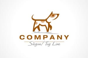
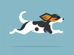
We then researched a range of graphic examples to inspire our logo design, here are the examples that I collected:

df225965ce21c6f5d66d103230d69ed6  11-bears-dog-logo  

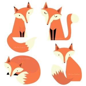
e28de73573396f72a326717999b4c1f7 foxfox-clip-art-il_fullxfull.362565184_ryea


I have gathered several examples to inspire the logo design. I particularly like these examples because they are all simple and use basic geometric shapes to create a very sleek professional graphic. As the brief stipulates, the logo needs to be fun and energetic, I think that these logos get that across with their use of colour. Much like these examples I think that the logo needs to include at least one bright bold colour to create a bright mood about the company. I believe it is essential that a dog is included in the logo and possibly a person to symbolise the bond and partnership between a owner and their dog. I particularly like design of the fox graphics, obviously this style could be adapted into a dog.

We then each had a go at designing a logo for the company. These are my first design sketches:

logo1

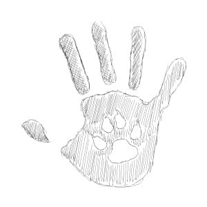
This is a rough digital sketch logo that I have designed. I came up with this idea to play on the element of ‘fun’ and ‘education’ that is requested in the design brief. My idea was to create a graphical ‘high five’ between a human and a dog to show how in the domestic animal behaviour centre you will have to work together with your dog to build that trusting relationship that will lead to a better trained dog. The style is also a little tribute to education as the in the final draft of the hand I would like it to me more of an imperfect hand print, which is often associated with school and learning when you were little. The design is simple enough to be of a high enough quality on all devices and at all sizes and the final draft would include a bright and fun colour scheme to accompany the design.logo2

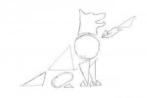
My second design is slightly more professional. It looks more at partnership and respect between a dog and their owner(s). I used a different style for this, taking inspiration from the examples that I found by using simple geometric shapes to create the image of a dog and used the same style on the human hand. In the final draft of this I would give the shapes a lot more depth by adding different shades of colour to make some parts appear more 3D and perhaps a shadow.

Screen Shot 2015-10-01 at 10.56.22

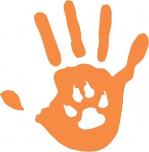
As a group we decided on our favourite logos. This is a final version of one of the logos that we decided on. Using illustrator I changed my rough sketch into a clean vector version that could be used on any platform in any format. Overall I am very happy with the design, it gets across that partnership between an owner and their dog through a graphical ‘high five’ and also the learning and education that you have to go through when getting a dog. We decided on orange in the end because it made it more fun, however the logo would have looked just as good in a calming blue.