This week we were tasked to get into groups and design a logo under a brief from a company. I was in a group with Natasha Cooke and Ben Adams and we communicated together via google docs. First we had to read the brief and interpret what the client wanted, this was my interpretation of the brief:
The brief as I interpret it, is to design a high quality professional logo that universally brands a domestic animal behaviour centre. The logo needs to be fun and positive, symbolising the relationship between a dog and their owner(s) and the mutual respect and learning that comes with owning a pet. The logo must avoid coming across as demeaning as the company will want to attract first time owners and also more experienced owners. The brief states that the logo should also be versatile so that it can be used in multiple formats so should be simple and high quality enough to suit a range of sizes.
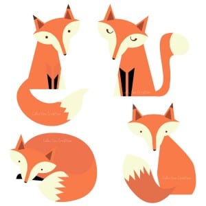
We then researched a range of graphic examples to inspire our logo design, here are the examples that I collected:
I have gathered several examples to inspire the logo design. I particularly like these examples because they are all simple and use basic geometric shapes to create a very sleek professional graphic. As the brief stipulates, the logo needs to be fun and energetic, I think that these logos get that across with their use of colour. Much like these examples I think that the logo needs to include at least one bright bold colour to create a bright mood about the company. I believe it is essential that a dog is included in the logo and possibly a person to symbolise the bond and partnership between a owner and their dog. I particularly like design of the fox graphics, obviously this style could be adapted into a dog.
We then each had a go at designing a logo for the company. These are my first design sketches:
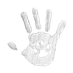
This is a rough digital sketch logo that I have designed. I came up with this idea to play on the element of ‘fun’ and ‘education’ that is requested in the design brief. My idea was to create a graphical ‘high five’ between a human and a dog to show how in the domestic animal behaviour centre you will have to work together with your dog to build that trusting relationship that will lead to a better trained dog. The style is also a little tribute to education as the in the final draft of the hand I would like it to me more of an imperfect hand print, which is often associated with school and learning when you were little. The design is simple enough to be of a high enough quality on all devices and at all sizes and the final draft would include a bright and fun colour scheme to accompany the design.
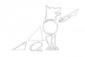
My second design is slightly more professional. It looks more at partnership and respect between a dog and their owner(s). I used a different style for this, taking inspiration from the examples that I found by using simple geometric shapes to create the image of a dog and used the same style on the human hand. In the final draft of this I would give the shapes a lot more depth by adding different shades of colour to make some parts appear more 3D and perhaps a shadow.
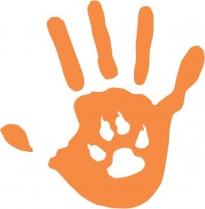
As a group we decided on our favourite logos. This is a final version of one of the logos that we decided on. Using illustrator I changed my rough sketch into a clean vector version that could be used on any platform in any format. Overall I am very happy with the design, it gets across that partnership between an owner and their dog through a graphical ‘high five’ and also the learning and education that you have to go through when getting a dog. We decided on orange in the end because it made it more fun, however the logo would have looked just as good in a calming blue.
