Development and Final Output Ideas

Development

When developing the app it was important for me to fig- ure out the theme of the app early on as this is an essen- tial part of how successful the app will be. It is essential because the app relies on the information supplied by the teachers and the parents, however if the app doesn’t provide a pleasant and easy experience when in use, providing this information will become a chore and the user will not want to utilise it.

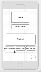
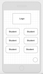
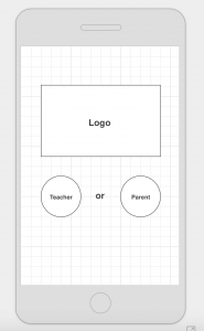
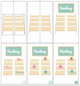
When coming up with the theme for my app I wanted to stress the collaboration between the teacher in the class- room and the parent at home. Therefore I have designed the ‘Main Page’ to look like a classroom for when the child is at school and will also later develop one for when the child is at home. I have produced these first drafts of the app layouts based on my Wireframes from the planning stage. The aesthetic theme of the app is also reflected throughout this document. I think this theme will be suc- cessful as it is easy on the eyes and is also quite gender neutral, therefore I will continue this theme into my final stages of development and prototyping.

Final Output Ideas

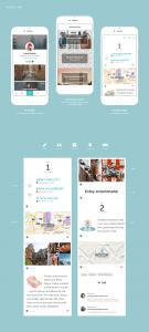
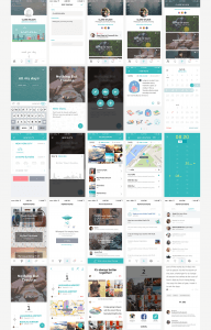
For the final output I would like to collage together all of the assets of the app that I have created into an infographic style prototype. To the left are some examples of this. The graphic would include some screen designs for the final app displayed in a mock up IOS iPhone scenario. Possibly it will include some text examples and colour palettes and will display all of the icons that would be used in the final app.

The infographic prototype will reflect the style and the theme of my app. Therefore it will need to attract my target audience and ap- peal to both male and female, parents and teachers. As the app will be designed to hold information about children I would also like it to have a gamified side. This could mean that the interface would become slightly childish however I would strive to also make the app suitable for its main audience, adults. To do this I would want to make an app design that looks trustworthy and professional, as par- ents and teachers would be entrusting it with delicate and personal information.

I would also potentially like to make a short motion graphic. The motion graphic would cover the purpose behind the app and how it could help the learning difficulties community. It will be short and simple and will also reflect the theme and branding of the app. To the left are some ex- amples of this for other apps. I believe that I am on target according to my schedule to finish this next section of development by week 11.

97d30332293399.568fc8d41e2c1 bf4dd032293399.56a5ac7f788ea 4cb63232293399.568fac36e67ac

Audience

Learning difficulties can affect all families, regardless of race, class or gender. Therefore the audience of the project is very diverse. However because it is specifically for the use of teachers and parents of children with learning difficulties it cannot be released to the general public for review and feedback. The idea should instead be introduced to the audience who would be the users of the app. To do this I published the pitch of the project concept to two learning difficulties discussion forums.

The Choice Forum  https://goo.gl/dArzxa

Since 2000, the Choice Forum has been the place to discuss issues affecting the lives of people with learning disabilities in the UK. Members include people with learning disabilities, parents, friends, relatives, people working in the field, national and local policy makers, service providers and commissioners.

Netmums  http://goo.gl/F6PBc1

Founded in 2000 Netmums is the UK’s fastest-growing online parenting organisation with over 1.7 million members and 8 million unique users each month. They have a Special Needs & Disabilities Support

The following is some feedback I received and my responses…

Is this app to be used in the classroom? I wouldn’t think any teacher would have time to use this app during class time. Is this for primary or secondary schools?

– Regards Sue Jenner


What a fantastic idea. I am the parent of a young woman of 28 who has profound and complex learning disabilities and also I used to work as SALT. Such an app would help us, as parents to communicate with professionals in a variety of setting. 

– Friendshipsmatter


I have some concerns about this. An app cannot replace empathy, experience or expertise nor appropriate training. With a combination of the change in the SEN system in England and austerity cuts schools have been put under pressure to assertively avoid the identification of children with SEN in order to avoid the cost of having to make provision for them. This is having a devastating impact on the children, their families, peers, teachers, etc but many people seem to be in denial or unaware of what is happening which in turn is contributing to the increase in the number of children, especially with SEN, developing mental illness or colliding with the criminal justice system. However well intentioned, an app is not going to solve our broken political system that is quite happy to spend billions of pounds of taxpayers’ money on warfare, nuclear weapons or subsidising the failed nuclear power industry but cannot fund the basic services, provision and infrastructure the country needs including meeting the needs of children with SEN. I am in despair at the state of the UK in general and what is happening in education in particular.

– Geordie


“My second daughter fits your description to a “T”, although I suspected 5 years ago she had Auditory Processing Disorder it took until October 2015 to get a diagnosis. The Primary school insisted she had no difficulties, although she had lots of support and was then diagnosed with profound ADP. I feel there are other undiagnosed problems such as Dyscaculia but getting anyone to listen to us (parents) is impossible. Now after being in secondary education for almost 6 months her grades as slipping, Maths SATs results were at level 4 and are now at level 2. SENCO at her school is brilliant, but this doesn’t help with the worries for my daughters future as she has always disappeared into the background. Although we are trying hard to support her we really are doing it blind as we know little of what goes on at school. I think the app would be so helpful and would love to know more.”


“This looks a really interesting and informative app, however, I have some reservations about will it actually be used? Already in most special schools there is a home/school diary systems, this is often filled in by LSA’s not the class teacher and only give a very broad view of the pupils day. For this to effectively work there need to be real trust between teacher and parent and total honesty about how the day has been. I supported a lad with challenging behaviour and we rarely told mum exactly what happened during the day with his behaviour as we didn’t want to paint too black a picture.

I also think there is an awful lot of demand on teachers particularly where students with additional needs are concerned such as paperwork etc, will they honestly fill these in on a daily basis. This would be amazing if everyone was committed to giving it the right amount of time.”

A consistent theme in the feedback that I received is that people are worried that:

– Teachers will not have enough time to fill in the required data about the student on the app and that it puts too much pressure on the teacher.

– That there would have to be significant honesty, trust and confidentiality between the teacher and the parent for the app to be successful.

– The app will not be enough to help the bigger issues that are wrong with the government system.

I will take this feedback into consideration when developing my app to try and address as many of the problems highlighted as possible to create a highly coherent and functional final app design.

Marketing

When mums were surveyed about how companies engage with them and their online marketing strategy, they received the following results:

– Only 19% believed mums had been involved in the marketing campaigns planning process

– Only 23% were happy with anyone other than their family calling them mum

– 79% bought a product after seeing it recommended on Mumsnet and 80% would look on Mumsnet before buying a product

Top five tips for engaging mums and parents in your online digital marketing:

1. Listen, engage, get to know and understand your audience before you start your marketing campaign.

2. Don’t say your product will make me a better parent, just give a better product.

3. Write genuinely funny or useful content only, entertainment is the key to successful marketing and will catch the eyes of those parents looking for some light relief. It’s fine to entertain them!

4. Help them celebrate the fun times; having fun with kids makes a mum feel like a better parent.

5. Do a good deed in a dark world and tell your brands story.

When marketing to teachers I want to try and build a strong following of loyal teachers who believe in the concept and idea. Hopefully, because the problem that the app will address is a genuine problem in the education system, this will attract teachers who want to do something about it.

Building trust between the teachers, parents and app developers will be vital. Therefore the marketing campaign should be very truthful, recognising the apps limits and boundaries but striving for positivity and ways to conquer the limits.

The advertising and marketing should be broken down into easy definable chunks. Addressing and getting across the main point and aim of the app up front is essential. Once the teachers and parents are invested in the idea the logistics can be focused on. It would be best to advertise the app at teaching fairs and conferences to gain a following life this. The teachers would then provide the connections to parents. Potentially to reach specific specialists, teachers and parents I could reach out to charities that help children with Learning Difficulties or attend charity events and conferences.

So many things that are designed with an educational purpose often fall short at being engaging and aesthetic, they tend to focus on the content side. The content is incredibly important, but it is also important to make sure the design captures the attention of the user and is enjoyable to use.

Marketing Review

Screen Shot 2016-03-09 at 4.07.14 am


‘And So To Bed’ is a bedtime routine app marketed at parents for children. The app uses repetition and visualisation to help children learn a bedtime routine.

The app has a website http://www.paperlyapps.com which explains how the app works and how to play it. It contains screenshots of the app in game to give the user an idea of what to expect. It contains the companies privacy policy and contact details, a blog on the recent news around the app and all of the media that the app has been reviewed on. Having a website that houses all of the most important information about the app is a good marketing technique as this is the first place people will look to find out about the app.

The creator of the app Gwendi Klisa stresses in an interview with the guardian her tips for developing and marketing the perfect app.

“Get people excited about your app, build a landing page and make sure it sees lots of traffic. Collect users’ email addresses and let them know when your app is launching. Blog about your app or open a Vine account and post short videos documenting your progress.”

“Your app is ready. You can’t wait to get it out there. Yet, hold on – don’t throw away the opportunity to aim for the bigger launch. Send the media a preview of your app before it is officially released. Your chance of press coverage has now increased. And you’ll score extra points if you organise an event for your launch.”

The app reached a large number of its target audience through its marketing campaign:

– It was featured in an article on mumsnet http://goo.gl/uD3rdQ

– An interview with the founder of the App Gwendi Klisa by ‘The App Guy’ is available on his podcast http://goo.gl/cpUfcT

– It was also reviewed on several german blogs

http://goo.gl/rONGGJ

http://goo.gl/R7IM1F

http://goo.gl/GkTtV8

http://goo.gl/1QDcn5

Planning and Development – First Prototypes

Planning

WireFrames

Screen Shot 2016-03-11 at 2.54.18 am Screen Shot 2016-03-11 at 2.43.27 am Screen Shot 2016-03-11 at 2.39.09 am


Development

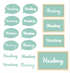
Logo Design:

Screen Shot 2016-03-11 at 1.44.22 am


Headway

noun

1. forward movement; progress in a forward direction:

The ship’s headway was slowed by the storm.

2. progress in general:

headway in a career.

3. rate of progress:

a slight headway against concerted opposition.

The App is going to be called Headway because of its positivity and connection to making progress. The App focuses on helping children with learning difficulties in moving forward/making headway in education.

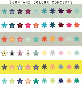
Icon and colour concept design:

Screen Shot 2016-03-11 at 1.44.30 am


Main Page Development:

Screen Shot 2016-03-11 at 1.44.07 am


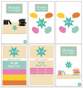
Student Profile Pages:

Screen Shot 2016-03-11 at 1.43.54 am